
The FFA emblem is all of those things. It's a mark that has stood the test of time, a familiar friend that takes us to our roots and stands for our pursuit of premier leadership, personal growth and career success through agricultural education.
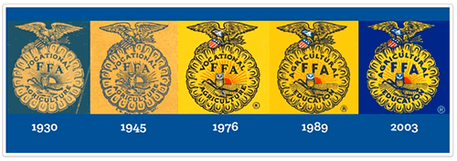
FFA has used some form of the emblem since its earliest days the national emblem was adopted during the first national convention of the Future Farmers of America in 1928 and used the features constructed in the emblem first used by the Future Farmers of Virginia and has made adjustments to it over time. The largest and most recent change came in 1989 when national convention delegates voted to change the words in the emblem from "Vocational Agriculture" to "Agricultural Education."
In 2013, FFA began a process to overhaul the expansive FFA.org to make it more user-friendly, easier to navigate, and more personalized to our wide range of users. The website redesign also offered a perfect opportunity to update the elements of the FFA brand to a consistent, cohesive look.
After extensive work and analysis, however, it became clear our most recognizable mark needed some updating. We found that the digital FFA emblem was created in an out-of-date process that caused problems with today's various production processes for digital, print and apparel use. Perfect reproduction of the emblem was often hard to achieve due to some of its incredibly intricate detail. Perhaps most importantly, it was clear that our iconic mark wasn't being shown in its best light.
With approval from the National FFA Board of Directors, FFA staff began a process to update the mark with a clear intention of preserving the elements and emotion that the mark has long held. The goal was a final product that both reflected the heritage of the FFA brand and was capable of reproduction in perfect quality, every time.
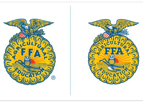
The result of that work is the refreshed FFA emblem you see above.
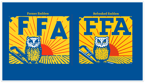
You'll notice that the refreshed emblem has been digitally enhanced to highlight the crisp, well-defined eagle, shield, arrows, owl and plow. On the eagle, the wings have been made symmetrical, while the the kernels of corn and rays of sun are new equally proportioned.
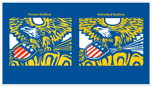
The fonts used within the emblem have been updated to look more reminiscent of the font used on the original emblem from 1928, and the registered trademark symbol an extremely important part of displaying the emblem at any time is now located within the border of the ear of corn.
Over the next year, you'll see the new mark deployed in more and more places. It will make its way to the FFA jacket with an accurate, more vibrant stitched embroidery, and will also begin to appear on other Shop FFA merchandise.
The emblem will also be more accessible for those who desire to use it non-commercially through the new FFA Brand Center on the redesigned FFA.org. There you'll find a comprehensive set of downloads and guides for how to best display it in a way that illustrates the tradition and pride in the mark.
The refreshed FFA emblem has arrived. We hope you'll love it as much as we do.
2.9.2015