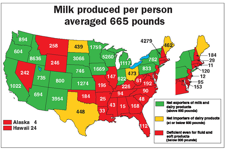
Countless statistics help quantify the U.S. dairy sector.
But if one map could most clearly depict the U.S. dairy industry, it’s this one, which compares each state’s milk production to its human population.
Green states
These are major dairy states that produce over 600 pounds of milk for every citizen. Those states are net exporters of milk and dairy products — either domestically (other states) or internationally (other countries).
The 600-pound total closely mirrors per capita dairy product consumption on a milk equivalent basis . . . think cows’ milk loaded onto milk trucks and shipped to processing plants. Eight of those states are super exporters, producing twice as much milk as their citizens demand — Idaho, Wisconsin, Vermont, New Mexico, South Dakota, Minnesota, Iowa, and Kansas.
Yellow states
The states in yellow happen to be net importers of dairy products, producing 300 to 600 pounds for every resident. Most of the imported dairy products would be cheese or butter.
Only four states fall into the yellow category — Maine, North Dakota, Ohio, and Texas.
Red states
These governing regions produce under 300 pounds of milk per person. The states in red do not even cover fluid milk or ice cream needs. These areas import milk from the green dairy states to cover consumer needs. Milk trucks or refrigerated products roll into these states on America’s interstate system.
A consistent trend
Over time, the green states have gotten greener due to higher milk production. On the flip side, most red states have become a deeper shade of red as milk production falls and the human population continues to grow.