The authors are with the Center for Dairy Profitability at the University of Wisconsin and Michigan State University. 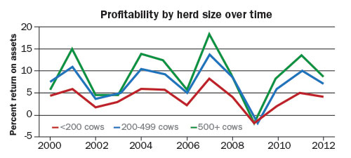
In order to be considered in this analysis, each farm had to have at least five years of consecutive participation to examine their performance over time. In all, our team poured over the data set of more than 7,000 records.
Profitability of all farms varied . . . with good years . . . mediocre years . . . and even negative return on assets (ROA). We did unearth one interesting observation related to herd size.
ROA across herd sizes was compressed in low profitability years. The graph shows years like 2000, 2002 to 2003, 2006 and 2009 when profits were lower than average.
During these years, the ROA on all farms was fairly similar. But, in high profit years such as 2001, 2004, 2007 and 2011, ROA on larger farms was significantly greater.
We can't make sweeping generalizations about farm size and profitability. Every year when data are collected there are individual farms that are profitable in all farm sizes and farms that are unprofitable across the size spectrum. But, it seems clear that larger farms recover more quickly from bad years and are capable of using their assets more intensively in the better years.
This may help to explain why more than half of the milk in the United States is now produced on about 3 percent of the largest farms.
To comment, email your remarks to intel@hoards.com.
(c) Hoard's Dairyman Intel 2016
February 29, 2016
In order to be considered in this analysis, each farm had to have at least five years of consecutive participation to examine their performance over time. In all, our team poured over the data set of more than 7,000 records.
Profitability of all farms varied . . . with good years . . . mediocre years . . . and even negative return on assets (ROA). We did unearth one interesting observation related to herd size.
ROA across herd sizes was compressed in low profitability years. The graph shows years like 2000, 2002 to 2003, 2006 and 2009 when profits were lower than average.
During these years, the ROA on all farms was fairly similar. But, in high profit years such as 2001, 2004, 2007 and 2011, ROA on larger farms was significantly greater.
We can't make sweeping generalizations about farm size and profitability. Every year when data are collected there are individual farms that are profitable in all farm sizes and farms that are unprofitable across the size spectrum. But, it seems clear that larger farms recover more quickly from bad years and are capable of using their assets more intensively in the better years.
This may help to explain why more than half of the milk in the United States is now produced on about 3 percent of the largest farms.
(c) Hoard's Dairyman Intel 2016
February 29, 2016